

For Christmas 2016 Mari bought me the ESV Readers Bible, Six Volume Set. That was the first Reader’s Bible I had had up to that point, and I loved it. It made it really easy to read large chunks of the Bible because it was so easy not to think about the chapter divisions and numbers. The text, by not having verse numbers, just flows.
Fast forward a few years, I really enjoy reading the CSB. It’s slightly more readable than the ESV, and the ESV is just slightly more literal than the CSB. Both are excellent, and both have their own benefits.
I’ll begin by saying that when it comes to details about margins, spacing, how this Bible is put together, you should head over to Bible Buying Guide by Randy Brown. The CSB Reader’s Bible was designed and typeset using 10 point Bible Serif, created by 2K/Denmark. It’s binding is poppy gray cloth over board, and it was printed in China.
The text spacing is closer than that of the ESV Reader’s Bible (at least that of the six-volume set). The text is easy to read and flows well together. There is a line gap between each chapter so you know there is a break in the flow. As well, each new chapter begins with the first letter in bold blue. There is no text in the header; the footer contains the page numbers (in black) and the book title and chapter numbers (in blue).
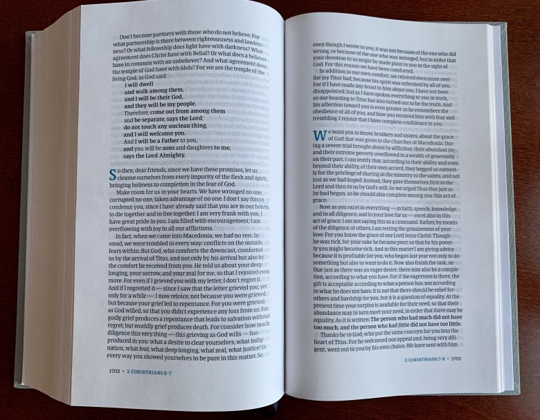
There are no verse or chapter numbers, cross references, or footnotes here. Without having other’s people’s notes (as valuable as they may be), the Bible is allowed to speak for itself. The point with the Reader’s Bible is for you to be able to easily read the Bible. As you can see, the layout is single-column like any other book. OT quotations are placed in bold (such as in 2 Cor 6 above and Hebrews below).

Below shows how the Psalms are lined up, and you can see how different sections within the same chapter (e.g., Psalm 23 below).

Staying Open
This Bible stays open on almost any page you open it up to (except for the very first page and the maps in the back). Here are a few pictures to demonstrate this.

The maps are in full color and are not glossed. Although I cropped it out, I had to hold down the map on the left because, unlike the rest of the Bible, some of these pages wouldn’t lie down on their own. However, a few pages not laying down on their own isn’t a deal breaker by any stretch.
I do prefer the cream colored pages of the ESV Reader’s Bible over the CSB Reader’s white pages. However they do aid in making the font more readable. Some of my pictures above which appear more orange-y are due to the lighting when I took the pictures (those of Hebrews and Psalms). The other pictures give you a more honest impression of what the pages actually look like.
As you can see on most of the pictures, the text from other pages tend to bleed through on the one you’re reading. At first this bothered me, but then I realized it’s exactly the same in my ESV Single Column Legacy Edition. However, I don’t know how much thicker you could make the pages before the Bible would become too thick (being that it is 1,824 pages long).
The Spoiled Milks
The one thing I wish this (and other) Reader’s Bibles would remove are the chapter divisions, at least some of them. Even though the chapter number isn’t given, you still know that there is a break in the text, and so it isn’t quite like reading a normal book or how Peter, Paul, or Ezekiel would have written the book (without verses and chapters). This isn’t an issue only with this Bible, but, from what I’ve seen, with all of the Reader’s Bibles. So if you’re fine with that, then this isn’t a big deal. But I do think removing the chapter divisions (except for Psalms and perhaps some of Proverbs) would make the text flow even smoother. Perhaps in the longer books (most of the Bible) they could keep the spaced gaps between chapters but without the capital bold blue letter.

One example is with Genesis 1–2. Genesis 2:1-3 (the first paragraph of chapter 2 above) actually belongs with Genesis 1 since it is the seventh day, the completion of the creation week. Genesis 2:4-25 is the next section, honing in on day 6. Now, all Bibles have this separation so everyone would be used to it anyway, but in a Reader’s Bible it’s still odd as the flow is broken here. Another odd place to have a gap is Acts 6-7, where there is an interruption in the meeting between the Sanhedrin and Stephen.
Recommended?
I really enjoy the CSB Reader’s Bible. It’s well laid out and it aids you in being able to pick up your Bible without having to have verse numbers interrupting the flow of your text. The Bible comes with a slip cover which will help protect it and keep it looking nice for a long time. If you haven’t picked up a Reader’s Bible, you really ought to consider getting on. My ESV Single Column Legacy Edition is my main Bible where I keep many of my notes, but I usually want to read a Reader’s Bible in the morning so that I don’t have any distractions. I either have my ESV with a commentary or a book, or one of my Reader’s Bibles without anything else. The CSB Reader’s Bible comes highly recommended.
Lagniappe
- Hardcover: 1824 pages
- Publisher: B&H Publishers (September 1, 2017)
- Text Layout: Single Column
- Text Color: Black Letter
- Text Size: 10 point
- Ribbon Marker: Yes
- Spine: Sewn
Buy this from Amazon or B&H Publishing!
Disclosure: I received this book free from B&H Publishing. The opinions I have expressed are my own, and I was not required to write a positive review. I am disclosing this in accordance with the Federal Trade Commission’s 16 CFR, Part 255 http://www.access.gpo.gov/nara/cfr/waisidx_03/16cfr255_03.html.
Amazon Affiliate Disclosure: As an Amazon Associate I earn from qualifying purchases.
